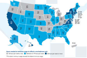
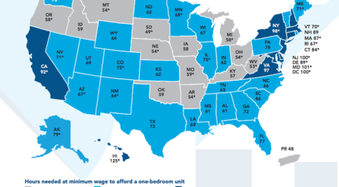
The standard for measuring housing affordability used to be that your mortgage or rent should be about 30% of your income, leaving the rest to cover food, utilities, transportation, medical care, and other expenses. A new report from the National Low-Income Housing Coalition shows that in 2015, working 40 hours at minimum wage isn’t even enough to cover the rent of a one-bedroom apartment in any state. In only 13 states and Puerto Rico, can you afford that apartment on less than 60 hours a week, with the lowest number of hours being in Puerto Rico (48) and South Dakota (49). At the other end of the spectrum, you’d need to work at least 100 hours in Washington, DC, Maryland, or New Jersey to afford a one-bedroom apartment on the minimum wage.
The full report, titled Out of Reach, is available on the National Low Income Housing Coalition website: nlihc.org. Thanks to www.aflcio.org there is an easy to read map showing where each state stands.